World-famous brand logos follow us wherever we go. We see them in TV commercials, on the way to work, and T-shirts. And, in 90% of cases, we have no idea of the hidden meaning in these seemingly abstract lines.
Today, Crfat Sides explains and even shows what all these smart logos really mean!
McDonald’s
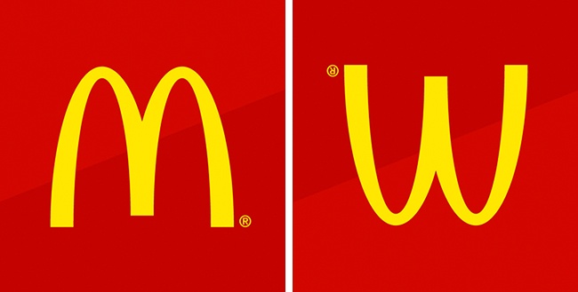
The designer of the first McDonald’s restaurants had the idea to equip the buildings with two large golden arches. These architectural features quickly became a symbol of fast food.
The company later wanted to abandon the logo, but psychologist Louis Cheskin persuaded management to keep it. He argued that this symbol was similar to an inverted image of female breasts, and thus reminded people of their carefree childhood.
Chanel
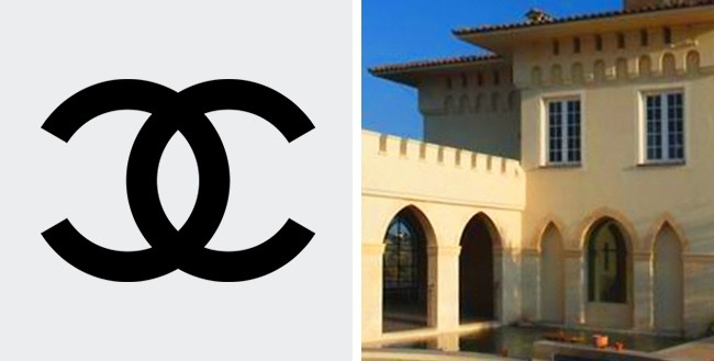
The history of creating this logo is very special and romantic. Coco Chanel drew it herself while staying at Château Crémat in Nice. According to popular legend, the world-famous symbol was inspired by the castle’s vaulted arches.
Many point to the magic of the letters since “CC” represents both the first letters of the castle’s name and Coco’s initials.
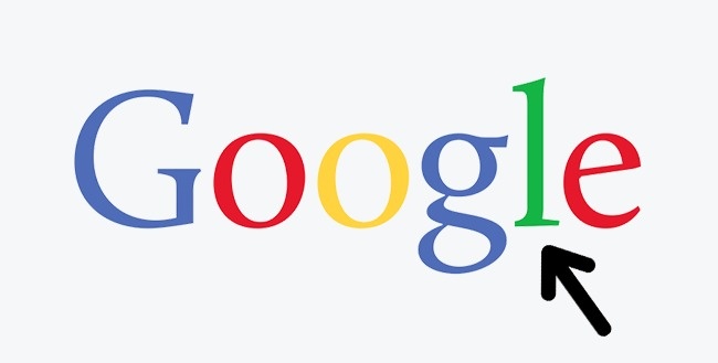
The creators of the Google logo used three main colors: red, yellow and blue. You can see that the layout within the logo is subject to a specific algorithm.
But the green letter breaks with general logic and clearly must be the most important letter in the word.
With this unexpected touch of green, the designers seem to suggest that Google is trying to break stereotypes and not follow the usual rules.
Gillette
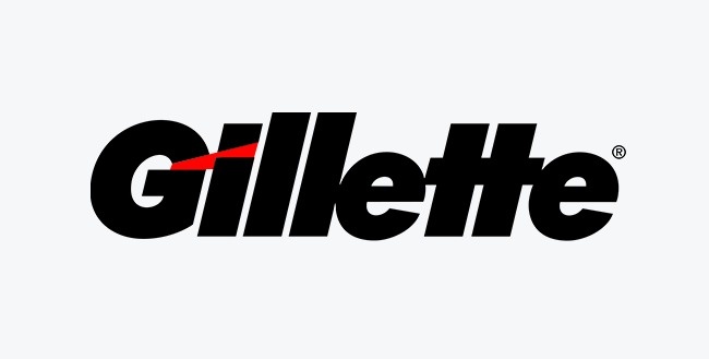
At first glance, it may appear that this logo contains only the Gillette brand. But if you look closely, you can see that the edges of the letters G and I mimic the shape of the famous shaving machine’s blades.
Mitsubishi
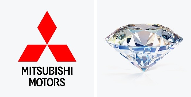
The basis of this logo consists of the Iwasaki family coat of arms, the founders of the Mitsubishi company. The coat of arms features three diamonds stacked on top of each other.
Diamonds represent reliability, integrity, and success, while the color red implies trust. Furthermore, the Japanese believe that this color helps attract customers.
Goodwill
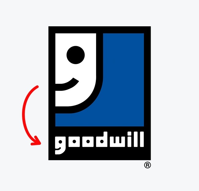
Goodwill is a world-renowned nonprofit organization that collects donations of food, clothing, and essential items to help the needy.
The organization’s employees believe that doing good deeds should not be considered unusual, but rather an everyday activity.
That is why its logo is built around the letter G, which, from a distance, resembles a happy face.
FedEx
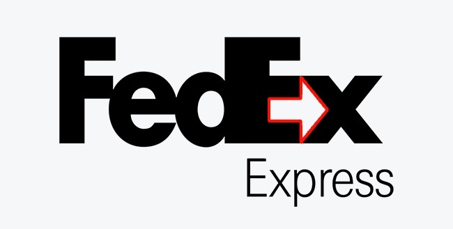
Most people don’t immediately see the arrow formed by the empty space between the letters E and X. But, when someone notices it, they start to see it first, and especially when they look at the logo!
And that is exactly what designers want: the arrow acts on the subconscious of customers, symbolizing the speed and reliability of the courier service.
Nike
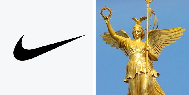
A student named Carolyn Davidson received just $ 35 for creating this logo in 1975. As you can imagine, the world-famous symbol represents the wings of the Greek goddess Nike, who used to inspire warriors to victory.
Pepsi
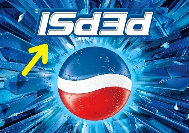
In the run-up to the Mexican All Saints Day (also known as the Day of the Dead), Pepsi once released bottles with an inverted logo.
Most customers thought it was a simple production flaw, but some of the more experienced buyers realized that when inverted, the Pepsi logo read “isded,“ which was very similar to the words ”is dead”!
Le Tour de France
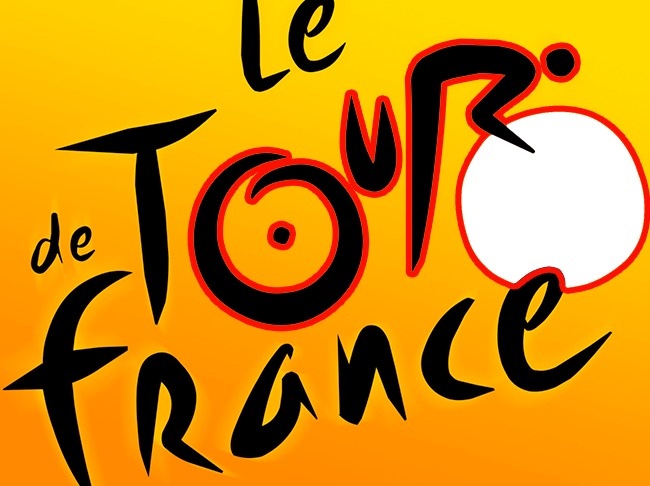
Even if you’ve seen the logo of the famous Tour de France cycling race a million times before, you’ve probably never noticed the image of a cyclist hidden in the letters.
Take a closer look: the letter R forms the rider’s body and the sun becomes the wheel of the bicycle.
Durex
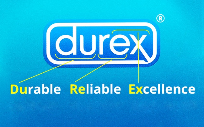
Durex is an abbreviation for “durable“, ”reliable” and “excellence”, basically everything you want from it, right?



Leave a Reply